It’s all in the scale
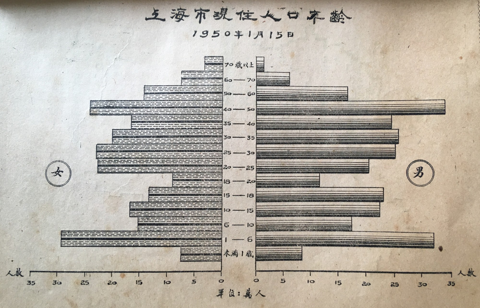
From a geometrical point of view, what was published in a collection of statistical data from Shanghai in the first year of the People’s Republic, can not really be called a population “pyramid”. The graph is rather akin to a cylindric accordion. Looking closely at the vertical scale, one will notice that the horizontal bars do not correspond to equally large age groups, they actually vary between less than one year, two, three, four, five, ten or theoretically infinitely many years. What information can one thus draw from this graph other than the obvious excess male population for all ages below 60 ? The horizontal axis applies an equal scale to female and male Shanghai citizens and informs the reader visually about the existence of a strong gender imbalance in Shanghai’s population.